
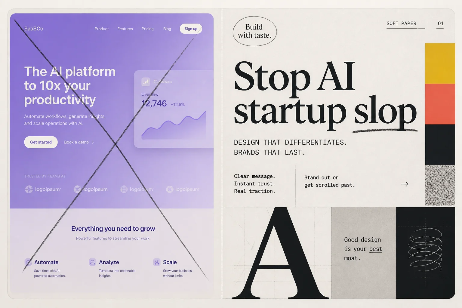
You have seen the aesthetic. White background, Inter or Geist, three equal cards in a row, hero headline in Title Case, subtitle about "elevating workflows," and a purple-to-blue gradient behind a glassmorphism dashboard mockup.
Claude did not invent that look. It just reaches for it constantly unless you intervene.
Anthropic's answer is not a blog post. It is a skill: instructions Claude loads before it writes frontend code. The frontend-design skill in anthropics/skills is the open-source template for "stop shipping template cosplay."
Why skills beat one-off prompts
A one-shot "make it look unique" prompt fades after the first file edit. Skills persist across turns because Claude re-reads SKILL.md when the task matches.
The frontend-design skill frames the agent as design lead at a small studio where templated work gets rejected. That mental model changes outputs more than a color palette suggestion.
Core mandate from the skill text:
- Make deliberate choices about palette, typography, and layout specific to this brief.
- Take one real aesthetic risk you can justify.
- Review the plan against the brief and revise anything that reads like a generic default.
- Build to production quality: responsive layout, accessible contrast, motion only where it earns its place.
The two-pass workflow
Before any code, the skill forces a short design plan:
| Plan section | What Claude must specify |
|---|---|
| Color | 4–6 hex values with roles, not "brand blue" |
| Typography | Display, body, and utility faces (explicitly not default Inter/Roboto) |
| Layout | One-sentence concept; asymmetric or split heroes encouraged |
| Signature | One memorable element tied to the brief |
Then the anti-default review: Claude compares the plan to what it would produce for a similar generic prompt. If the answer overlaps, it revises and states what changed.
Only after that does implementation start. Colors and type in code must trace back to the plan.
Community reference docs like anti-slop-rules.md spell out fingerprints to avoid:
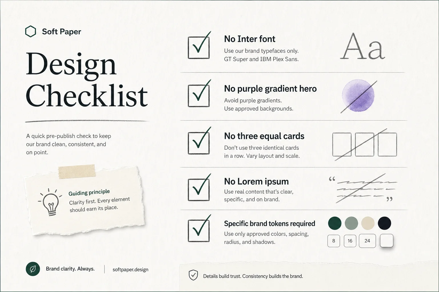
- Purple/blue gradient as the main aesthetic
- Three equal feature cards in a centered row
h-screeninstead ofmin-h-[100dvh]on mobile- Lorem ipsum and startup names like "Nexus" or "SmartFlow"
- Copy verbs: Elevate, Seamless, Unleash, Next-Gen
The skill is opinionated on purpose. Clients pay for sites that look like their business, not like every other AI demo from the same week.
How to install it
Claude Code plugin path (bundled):
# From Claude Code: frontend-design ships as a plugin skill
# See: github.com/anthropics/claude-code/tree/main/plugins/frontend-design
Manual skill path:
git clone https://github.com/anthropics/skills
cp -r skills/skills/frontend-design ~/.claude/skills/frontend-design
Skills CLI (agents that support it):
npx skills add https://github.com/anthropics/skills --skill frontend-design
Invoke by describing a frontend task after the skill is on the path. Claude should load it automatically when the task matches "build a landing page" or "restyle this component."
What good output looks like
The skill does not mandate one style. It mandates intention. Acceptable directions from the skill docs include brutalist, retro-futuristic, luxury minimal, organic, editorial, and maximalist, as long as execution matches the vision.
What changes in practice:
| Without skill | With frontend-design |
|---|---|
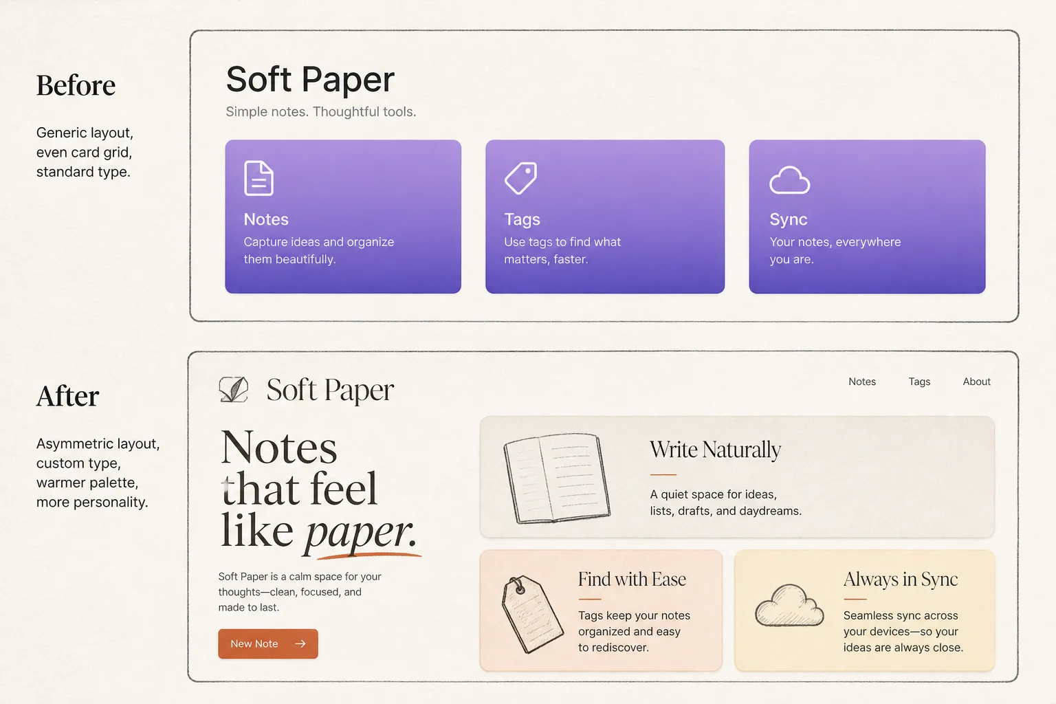
| Inter + purple gradient hero | Paired display/body fonts with a defined scale |
| Three identical feature cards | Asymmetric grid, zig-zag, or scroll layout |
| Decorative motion everywhere | One orchestrated load or scroll moment |
#000000 backgrounds | Off-black or tinted dark (#0a0a0a, zinc-950) |
| "Elevate your workflow" | Plain, specific copy tied to the product |
The skill also channels Coco Chanel by way of engineering: before you ship, remove one accessory. Extra borders, redundant gradients, and duplicate badges are where AI pages accumulate noise.
Pair it with other skills
I run frontend-design alongside:
- make-pages-interactive for browser commenting on HTML drafts
- web-artifacts-builder when the deliverable needs React + Tailwind artifacts
- Custom brand skills with your hex values and font files for repeat clients
Order matters: design skill first, interactive feedback second. There is no point polishing comment pins on a page that still looks like a template.
When this is not enough
Skills steer the model. They do not replace a human designer on high-stakes brand work. For regulated industries or established brand systems, I still extract real tokens from Figma and write a client-specific SKILL.md with locked colors and type.
Skills also will not fix bad briefs. "Build me a SaaS landing page" will still trend generic if you do not name audience, tone, and one thing the page must communicate.
Bottom line for builders
Anthropic open-sourced the instruction set they use to keep Claude's frontend output out of the uncanny "AI startup" valley. Install it once, keep it on the skills path, and require the two-pass plan for any customer-facing HTML.
Your competitors are still pasting purple gradients. You do not have to.
Need help turning skills into a repeatable delivery pipeline for lead sites or product UI? Book a free discovery call.